Team
Vasilii Podriadchikov (Art Direction)
Alex Bazan (Brand/Digital Design & Management)
Alexandra Korbankova (Brand Design)
Alex Kovalevsky (3D Artist)
Stas Mishin (Front-End, Back-End)
Team
Vasilii Podriadchikov (Art Direction)
Alex Bazan (Brand/Digital Design & Management)
Alexandra Korbankova (Brand Design)
Alex Kovalevsky (3D Artist)
Stas Mishin (Front-End, Back-End)
Services
Brand Strategy
Visual Identity
Web design
Motion
3D
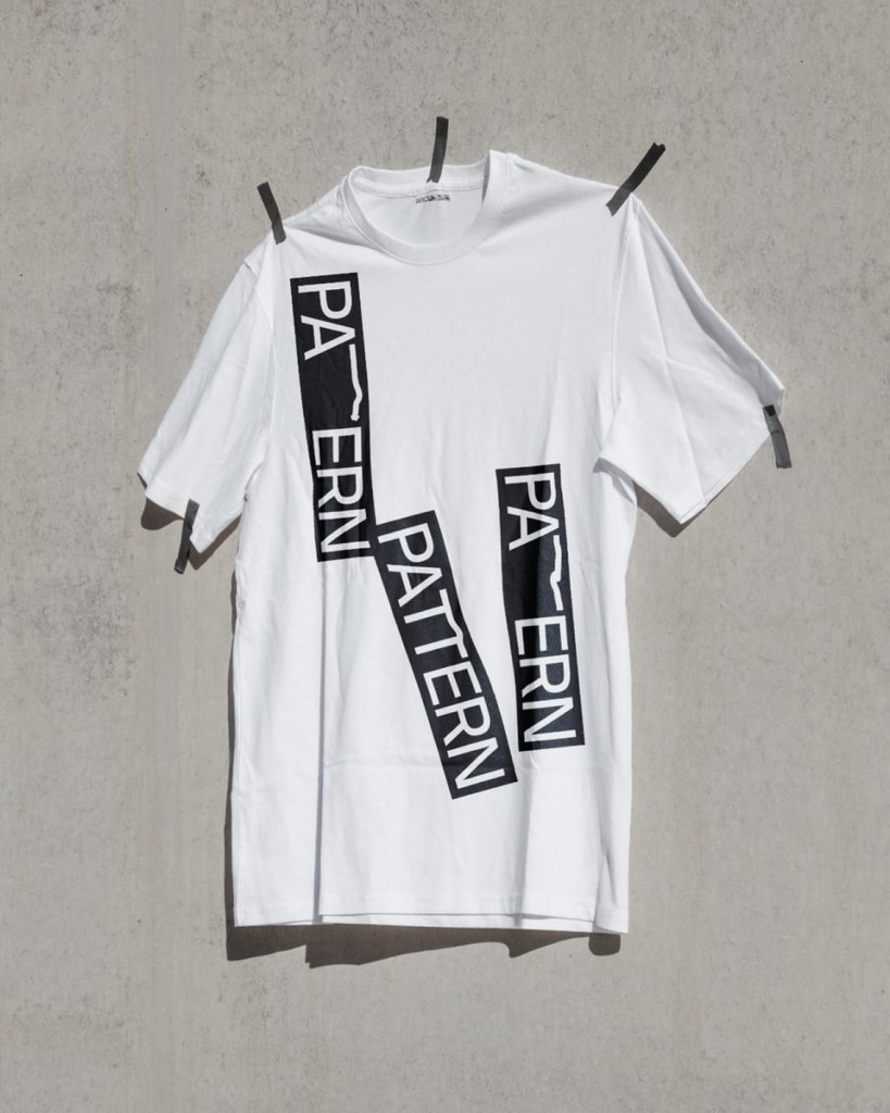
Merchandise
Brand Guidelines
Services
Brand Strategy
Visual Identity
Web design
Motion
3D
Merchandise
Brand Guidelines
About
ARCHITONE, a supplier of fiber cement panels, primarily caters to architectural firms. These modern materials offer exceptional versatility in facade design, providing a wide array of options in shape, size, cut, and finishing techniques. These characteristics give each building unique features and serve as excellent tools for architects’ creativity and developers’ investments.
Challenge
Develop a distinct brand identity and positioning that resonates within the architecture industry.
Solution
The brand philosophy we adopted is “For people who care about design, authenticity, sustainability.” The central idea is based on the concept of limitless design possibilities. One of the key metaphors we embraced is music (scores), which embodies this concept. The primary graphic techniques employed were dynamic, transforming lines and layouts.
“Our rebranding has deepened our connection with architects, enabling us to speak their language and stand out as a production company that prioritizes client experience, unlike our competitors.” – Pavel Gusev, CEO at ARCHITONE.